
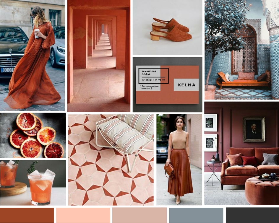
The first day of fall is here and as most people are whipping out the pumpkin spice, the RO & Co. Events team couldn’t help but walk back through Pantone‘s chosen palette for this season and get uber inspired. However, one color in particular stuck out and brought a little inspiration our way: Potter’s Clay. A mix up between a russet orange and rust, this earth tone oozes warmth and works as a strong jumping off point from an original “orange” you typically see in the fall. In the midst of all the oranges combos of the world, Potter’s Clay looks amazing with pinks (our fave), some lush emeralds and touches of blue. We collected some imagery from around that web that showcases some fun color combinations that you could tie in with this hue to create an unexpected fall palette with traditional roots for any of your autumnal events. Happy Fall, y’all!
For more Potter’s Clay and other inspiration be sure to check out our Pinterest.
Photo Credits Clockwise from Top Left:
Tommy Ton // Kelly Wearstler // Olive Austin // Anton Shineft // Brydie Mack // Mowielicious // Holly & Flora // Cathrina Broderick // Image via Pinterest // Image via Pinterest